Basic web design tips
I decided to write this blog post base on my past web design experience. I've made so many mistakes in the area of web design (user interface).
Over the years, I notice that I focus more in designing pages to fit in desktop screen. This is a bad practice for everyone both designers and end users in the 21st century regarding a research about devices been used for browsing.
Base on a recent research, 95% of people uses mobile phone when browsing the internet. This should not lead us to forget about the little amount using desktop and laptop computers.
Read: How to create new post on nairaland forum
Read: How to create new post on nairaland forum
What is Responsive Web Design?
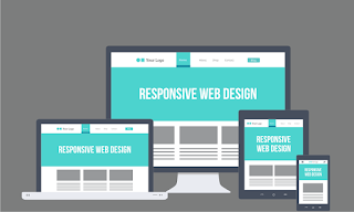
We're all familiar with the word "Responsive", right? In web design, responsive is simply making or creating website to fit in every device screen, mobile, desktop, laptop and tablet device.
Read:HTML web page linking guide
Read:HTML web page linking guide
Another common word for making website responsive in mobile device is "Mobile Friendly".
By default we use laptop or desktop when designing web pages. In this case, most web designers end there, they do not think further by using chrome browser to check if the web page is fit into mobile view or not.
Read: How to create Facebook kind of like button system
Read: How to create Facebook kind of like button system
Please at this point, allow me to guide you on how to design web page considering mobile, desktop, tablet users.
I have already written a post on how to design responsive website. So in this post, I'll not be dealing with elements, but in the future, I'm still going to make more posts about creating responsive web pages or websites using @media css property.
I assumed you already know how to create responsive web page using the css @media property, if not learn how to create responsive website.
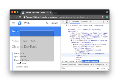
With the help of chrome developer tool, resizing web page to check responsiveness is made very easy. You don't need multiple device to test responsiveness.
With the help of chrome developer tool, resizing web page to check responsiveness is made very easy. You don't need multiple device to test responsiveness.
Below is the simple step to take in other to check if a web page is responsive or not using chrome browser
Right click plain area and select inspect from the options.
for shortcut, press control + shift + I to open inspect environment.
Now resize to see the responsiveness of your page.
Now resize to see the responsiveness of your page.
How to view page source using chrome web browser
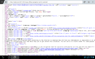
Right click on a plan text, image free area and select view page source from the displayed options.
for shortcut, press control + U to view page source.
Note: You can't view php source code because it is the backend source.
Many are reading these articles;
How to make object transparent using css opacity
How to screenshot any environment on windows OS
Click here to learn more computer shortcut keys
How to improve your web design skill
Note: You can't view php source code because it is the backend source.
Many are reading these articles;
How to make object transparent using css opacity
How to screenshot any environment on windows OS
Click here to learn more computer shortcut keys
How to improve your web design skill


I would love to see more on this
ReplyDeleteMore please
ReplyDelete